| Author |
 Topic Topic  |
|
semin-rules
PickupHockey Veteran

Canada
1915 Posts |
 Posted - 12/16/2006 : 14:38:36 Posted - 12/16/2006 : 14:38:36


|
Poll Question:
who do you think has the coolest logo??
you can tell my why if you want
|
|
|
|
Guest4950
( )
|
Posted - 12/16/2006 : 15:03:57
|
Vancouver Black with the colourful V in the middle.
AND
The tried and true White and Blue of the Maple Leafs.any era. |
 |
|
|
Guest4785
( )
|
Posted - 12/16/2006 : 15:08:05
|
The leafs logo is classic and will never go out of style.But common...
the Canucks old jerseys were butt ugly. Whoever thinks those are nice seriously needs to see a doctor.
(In this case it's Guest4950) |
|
|
|
bablaboushka
PickupHockey Veteran

Canada
2417 Posts |
Posted - 12/16/2006 : 16:07:38
|
| The Minnesota Wild logo. There was actually thought put into it to give it a "visual double-entendre". I also like the new Kings logo and the Penguins logo, mainly because I like Penguins. |
|
|
|
B-rett10
Rookie

Canada
186 Posts |
Posted - 12/16/2006 : 22:18:22
|
Minnisota, Lots of detail.  |
|
|
|
framer87
PickupHockey Pro

Canada
338 Posts |
Posted - 12/17/2006 : 08:40:37
|
Minnesota
Go pens |
|
|
|
Trevman12
Rookie
Canada
182 Posts |
Posted - 12/17/2006 : 08:58:10
|
| minnesota, looks the newest. |
|
|
|
Guest4677
( )
|
Posted - 12/17/2006 : 09:35:01
|
| Minnesota wild would be my pick. |
|
|
|
Mikhailova
PickupHockey All-Star

USA
2918 Posts |
Posted - 12/17/2006 : 09:39:06
|
| Me too--I like Minnesota's the best |
|
|
|
B-rett10
Rookie
Canada
186 Posts |
Posted - 12/17/2006 : 14:02:39
|
Minnisota's is the best
|
|
|
|
spearbelly
Top Prospect
Canada
98 Posts |
Posted - 12/18/2006 : 00:00:54
|
You talkin LOGOS ...WINGS
You talkin JERSEYS.....HAWKS road jrsy ,......I mean the home jers........THE" RED ONE " |
|
|
|
Guest4232
( )
|
Posted - 12/18/2006 : 04:45:24
|
| Must say Minnesota's logo but a terrible colour green in the jerseys themselves |
|
|
|
Guest4912
( )
|
Posted - 12/18/2006 : 08:06:47
|
| nashvilles kicks ass |
|
|
|
Guest4912
( )
|
Posted - 12/18/2006 : 08:11:24
|
I like edmontons logo the best!
go oil! |
|
|
|
admin
Forum Admin


Canada
2345 Posts |
Posted - 12/18/2006 : 09:03:17
|
| Of the ones you have listed - I say New Jersey. Not a big fan of Minnesotas logo like most of you. I am also a big fan of the original 6 logos/jerseys. |
|
|
|
Mikhailova
PickupHockey All-Star
USA
2918 Posts |
Posted - 12/18/2006 : 12:47:33
|
The Canucks alternate jerseys are cool...
I like the fading effect
[img]http://www.prosport.ca/images/V_Canucks_T.gif[/img] |
|
|
|
semin-rules
PickupHockey Veteran
Canada
1915 Posts |
Posted - 12/18/2006 : 18:46:28
|
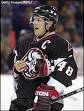
yeah aite i think we can all agree that minnesota is winning right now lol but you you no who knowone is putting up or votting for is the penguins jersey.. its origanl and cool and its a really cool design
¥¥¥bobby ore!!!!¥¥¥ |
Edited by - semin-rules on 12/18/2006 18:47:14 |
|
|
|
bablaboushka
PickupHockey Veteran
Canada
2417 Posts |
Posted - 12/18/2006 : 18:47:42
|
Who's bobby ore?
How is the Penguins logo original? It's a Penguin (where did that idea come from?) holding a hockey stick. A dozen logos have something holding a hockey stick. It's not ugly but it's certainly not original. |
Edited by - bablaboushka on 12/18/2006 18:49:42 |
|
|
|
semin-rules
PickupHockey Veteran
Canada
1915 Posts |
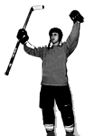
Posted - 12/19/2006 : 06:18:58
|
| bobby ore is the guy in my pic he scored the winning goal in overtime in the stanley cup finals and he was better than wayne gretzky in my opinion and yeah i guess its not original your right |
|
|
|
Ryan Harper
PickupHockey Pro

Canada
322 Posts |
Posted - 12/19/2006 : 08:34:14
|
quote:
Originally posted by semin-rules
bobby ore is the guy in my pic he scored the winning goal in overtime in the stanley cup finals and he was better than wayne gretzky in my opinion and yeah i guess its not original your right
Im pretty sure he was joking. See you have spelled his name wrong (not the only spelling mistake either)
Bobby Orr.
"Some people skate to the puck. I skate to where the puck is going to be."
~Wayne Gretzky
|
|
|
|
Guest6916
( )
|
Posted - 12/19/2006 : 08:41:27
|
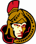
| I'm a big fan of the Senators logo. |
|
|
|
Guest6916
( )
|
Posted - 12/19/2006 : 08:42:58
|
quote:
Originally posted by Guest4785
The leafs logo is classic and will never go out of style.But common...the Canucks old jerseys were butt ugly. Whoever thinks those are nice seriously needs to see a doctor.
(In this case it's Guest4950)
Ugliest jerseys in the history of the NHL - bar none! |
|
|
|
Guest4912
( )
|
Posted - 12/19/2006 : 09:45:31
|
| I absolutley hate canucks logo. |
|
|
|
ultimatetitman
Rookie
Canada
244 Posts |
Posted - 12/19/2006 : 13:40:31
|
You're all gonna laugh, but hear me out. I think the coolest logo out there is the the Phoenix Coyotes.
First of all I am a fan of the old time uniforms and think that Chicago has the nicest overall uni! But Phoeniz has such a cool blend of old and new. The uniforms look like they are almost an original 6 team, with a twist. The logo is contemporary yet simple.
And it's a helluva an improvement from their old logo!
Edit: Removed image as it was breaking the page. See if we can find a smaller one. Thanks, Admin.
|
Edited by - ultimatetitman on 12/19/2006 16:01:07 |
|
|
|
Guest8985
( )
|
Posted - 12/19/2006 : 15:21:17
|
for best logo i would say Minnesota but best uniform i would say Canucks vintage.
Edit: Removed image as it was breaking the page. See if we can find a smaller one. |
|
|
|
bablaboushka
PickupHockey Veteran
Canada
2417 Posts |
Posted - 12/19/2006 : 16:13:33
|
| It's not about jerseys, it's about logos. Plus, that jersey blowz. |
|
|
|
semin-rules
PickupHockey Veteran
Canada
1915 Posts |
Posted - 12/19/2006 : 16:15:34
|
| yeha it doesnt matter what color the jersey is its about the logo in the middle |
Edited by - semin-rules on 12/19/2006 16:15:51 |
|
|
|
Guest4689
( )
|
Posted - 12/20/2006 : 09:23:36
|
[quote]Originally posted by Mikhailova
The Canucks alternate jerseys are cool...
I like the fading effect
|
|
|
|
Mikhailova
PickupHockey All-Star
USA
2918 Posts |
Posted - 12/20/2006 : 13:32:01
|
Yeah  |
|
|
|
Ryan Harper
PickupHockey Pro
Canada
322 Posts |
Posted - 12/20/2006 : 13:37:57
|
quote:
Originally posted by bablaboushka
It's not about jerseys, it's about logos. Plus, that jersey blowz.
No it doesn't
"Some people skate to the puck. I skate to where the puck is going to be."
~Wayne Gretzky
|
|
|
|
bablaboushka
PickupHockey Veteran
Canada
2417 Posts |
Posted - 12/20/2006 : 13:41:05
|
| Point is that this thread is about logos not jerseys. |
|
|
|
Trevman12
Rookie
Canada
182 Posts |
Posted - 12/20/2006 : 15:55:46
|
quote:
Originally posted by bablaboushka
Point is that this thread is about logos not jerseys.
Ya, I agree. If you want to talk about jerseys, go make a poll about it. |
|
|
|
semin-rules
PickupHockey Veteran
Canada
1915 Posts |
Posted - 12/22/2006 : 06:02:49
|
i really like the florida panthers logo
[img]http://www.amincousa.com/zcart/images/nhl/nhl-n26.gif[/img] |
|
|
|
Guest4652
( )
|
Posted - 12/22/2006 : 08:03:43
|
| Nashville, The logo is sharp and evevn better with the mustard uni's. |
|
|
|
Mikhailova
PickupHockey All-Star
USA
2918 Posts |
Posted - 12/22/2006 : 14:57:49
|
quote:
Originally posted by semin-rules
i really like the florida panthers logo
[img]http://www.amincousa.com/zcart/images/nhl/nhl-n26.gif[/img]
Yah, LOL
It looks like my cat |
|
|
|
Guest6575
( )
|
Posted - 12/23/2006 : 05:43:23
|
| anything vintage is usually the best, canucks 3 logos are by far my favorite |
|
|
|
Guest6575
( )
|
Posted - 12/23/2006 : 05:48:47
|
| Hatford Whalers i would have to say are arguable the most sleek and attractive uniforms I have ever seen in my life time. Color choiche absolutly fantatic, and the whale tale sticking out of the water, pricelsess |
|
|
|
Blubberboy
Rookie

155 Posts |
Posted - 01/03/2007 : 18:03:08
|
Buffalo new is cool it is sweet!!
Go Vancouver!! |
|
|
|
semin-rules
PickupHockey Veteran
Canada
1915 Posts |
Posted - 01/05/2007 : 09:32:45
|
i hate buffalos new jersey it makes me think of a mouse on drugs wiht horns. it doesnt resemble a buffalo or a sabre it makes me think of a mouse on drugs wiht horns. it doesnt resemble a buffalo or a sabre
its just bad
[img]http://placenamehere.com/objects/blog/newsabres.png[/img]
~~~~~GO STARS~~~~~ |
Edited by - semin-rules on 01/05/2007 09:33:11 |
|
|
|
Guest4060
( )
|
Posted - 01/06/2007 : 13:30:42
|
| penguins one with the penguin with the hockey stick collest logo ever |
|
|
|
Guest4060
( )
|
Posted - 01/06/2007 : 13:32:45
|
| SIDNEY CROSBY LOGO IS REALY COOL HAVE YOU SEEN IT IT IS ON THE TIM HORTONS COFFE COMERCIAL SYDNEY CROSBY DESIGEND IT ALL BY HIMSELF IT IS THE BEST FREAGIN THING I HAVE EVER SEEN ON MY WHOLE LIFE |
|
|
|
Topic |
|