| Author |
 Topic Topic  |
|
|
Lee Marshall
Rookie


Canada
102 Posts |
 Posted - 03/28/2012 : 07:46:53 Posted - 03/28/2012 : 07:46:53


|
We [mainly] call 'em sweaters. The Americans seem to prefer jersey...although sweater, I believe, is actually correct. At any rate...although I am a Leaf supporter and I think our uniforms are pretty darned cool...My favourite all time is the Chicago Black Hawks sweater. I like both the red version and the newer black rendition. The detail is great. It makes all of the other original 6 sweaters look pretty plain and simple by comparison.
Although the logo is cool...I find the Red Wings sweaters to be the most boring...both home and away.
The Leafs still have the best socks/stockings out there. Although their Ballard-era sweaters and socks were HORRIBLE. Imagine. An established team taking on the look of an expansion team!!! What dreck!!!
ps...The new Winnipeg Jets look is terrific.
Who the cap fits...Let them wear it.
|
Edited by - Lee Marshall on 03/28/2012 07:49:46
|
|
|
Alex116
PickupHockey Legend


6113 Posts |
Posted - 03/28/2012 : 08:05:15
|
To me, they're jersey's! Maybe in the old days they were more like a sweater, but imo, it's a jersey!
Chicago's is pretty cool, though i do like some of the simple ones. I like both Toronto's and Detroit's but Lee i'm confused how you can call the Red Wings one "boring" and not the Leafs? The Wings is a def classic, and if you look at what it really is, it's kinda weird (a wing protruding from a wheel?) but it's that nostalgia that kicks in for me. Prob why i think the Habs one is the best of the original 6. Not sure if it's got something to do with growing up in the 70's when they were a powerhouse, but there's something about it i like. Oh, and a very close 2nd as far as the original's for me is the Bruins.
One of my all time favorites though, and this is more to do with the logo than the entire jersey, is the Hartford Whalers, mostly because i didn't see the "H" in it for years until my dad pointed it out one day to me. The logo had prob been around for 5 or 6 years at that point and when he showed me, it just seemed really cool, especially that i'd missed it for so long!
All time worst for me is the "Flying V" of the Canucks from the late 70's / early 80's. SOOOOO bad, not even a logo on it. Even worse is that the designers claim the "V" was supposed to stand for "Victory". Lol. Still not sure why anyone nicnamed it the "flying V" either?. 2nd worst, the old Coyotes one that looked like the character from the Spy vs Spy comic. Even the colours in that one were terrible. |
 |
|
|
@valanche
Rookie
Canada
240 Posts |
Posted - 03/28/2012 : 08:45:48
|
avs (alternate jersey)
bruins (alternate jersey)
nashville's new jersey
jets dark jersey
66 is > than 99 |
|
|
|
Lee Marshall
Rookie
Canada
102 Posts |
Posted - 03/28/2012 : 09:40:59
|
Alex...this'll probably sound un-Canadian...but I don't find red and white to be all that eye-catching [would have prefered the Liberal version of the flag with the 2 blue borders...signifying the 2 oceans.]
And again...while I think the Detroit winged wheel logo is outstanding...the 'detail'...or lack of same on the Red Wings' sweaters and socks is just...boring.
I agree that Boston and Montreal both have a good look. That Vancouver attire from back in the day was so horrible I'm surprised Don Cherry didn't turn it into a sports jacket.
Who the cap fits...Let them wear it. |
|
|
|
@valanche
Rookie
Canada
240 Posts |
Posted - 03/28/2012 : 10:15:09
|
also the kings purple jerseys
66 is > than 99 |
|
|
|
Shepsky
Rookie

Canada
211 Posts |
Posted - 03/28/2012 : 13:01:04
|
this is opposite to the question, but, remember the yellow jerseys (I to prefer to say Jersey over sweater, but whatever) that the Bruins wore temporarily a couple years ago. They were IMO the worst jerseys that any organized sports team has worn
Every day is a great day for hockey
-Mario Lemieux |
|
|
|
Guest8450
( )
|
Posted - 03/28/2012 : 13:10:48
|
| The avs alternate jersey. |
|
|
|
mandree888
PickupHockey Pro


Canada
400 Posts |
Posted - 03/28/2012 : 13:16:45
|
quote:
Originally posted by Shepsky
this is opposite to the question, but, remember the yellow jerseys (I to prefer to say Jersey over sweater, but whatever) that the Bruins wore temporarily a couple years ago. They were IMO the worst jerseys that any organized sports team has worn
Every day is a great day for hockey
-Mario Lemieux
i dont know shepsky the islanders 3rd jersey is pretty bad as well.
i would have to say i love the nashville yellow jersey and the flyers jersey. (only because orange is my fav colour.) rofl |
|
|
|
Clatts
PickupHockey Pro
Canada
266 Posts |
Posted - 03/28/2012 : 13:36:34
|
Best individual jerseys - Canucks Orange and yellow Jersey with the skate in it, the Black Bruins with the actual bear and the old jets and Northstars jerseys.
worst individual jersey - Calgary's Horse head, Canucks Flying V or Stick, the islanders current 3rd jersey.
Team with the best overall colours and designs - Boston Bruins
Team with worst overall colours and designs - Colorado
"Most of the guys that wear them are Europeans and French Guys."
Don Cherry on Visors |
|
|
|
Alex116
PickupHockey Legend
6113 Posts |
Posted - 03/28/2012 : 15:04:47
|
Wow, where to start....
Lee.....You're right, you sound very "un-Canadian"! Lol
@valanche....yup, those purple things were terrible!
Shepsky....which yellow B's jersey? Are you talking about the one with Winnie the Pooh on the front? I hated that one!
Mandree....which Isles one is that? The Captain Highliner one? If so, i hated that one too. Any i agree, the Philly uni's are great. That colour scheme just oozes toughness!
Clatts....Are you serious about the Canucks "skate" jersey? I hated it then and i hate it now! It was unbearable till they went to white for the jersey colour and even then it was barely acceptable!  The B's one i'm assuming is the one of the full side profile of the bear? I like that one, but the one that i mentioned earlier that looked like Pooh bear was bad! And yes, Calgary's flaming horse head was pretty bad as well! The B's one i'm assuming is the one of the full side profile of the bear? I like that one, but the one that i mentioned earlier that looked like Pooh bear was bad! And yes, Calgary's flaming horse head was pretty bad as well!
Whew....hope i didn't miss anyone. |
|
|
|
ToXXiK1
PickupHockey Pro

Canada
696 Posts |
Posted - 03/29/2012 : 05:23:48
|
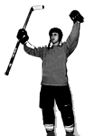
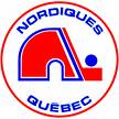
Nordiques
Chicago
Bruins Alternate
|
|
|
|
Shepsky
Rookie
Canada
211 Posts |
Posted - 03/29/2012 : 11:58:26
|
Alex, I was definitely talking about the ones with Winnie the Pooh, hilarious!!
Every day is a great day for hockey
-Mario Lemieux |
|
|
|
Open_Ice
Rookie

Canada
109 Posts |
Posted - 03/29/2012 : 12:23:43
|
| All history aside, the simplest logo in the NHL is the Blue Leaf. Let me say that again, BLUE? Never understood it but it's a recognized symbol now so I guess it's not going to change. |
|
|
|
Beans15
Moderator


Canada
8286 Posts |
Posted - 03/29/2012 : 14:21:20
|
I'm showing my bias, but I really dig the blue and orange Oiler jerseys. I am not a huge fan of the logo but the colors look slick. It was a long gap between the early 90's and the past few seasons of going through various color patterns only to land back where it always should have been.
I really like the old Sabre's jerseys with the buffalo in the middle of the two sabres. Hartford was cool as was the old Colorado Rockies logo. I also like the Nordiques jerseys and Chicago is at or near the top of my list.
Can stand the simple word across the front on an angle jerseys like the Rangers and Colorado's alternate. Don't like simple jerseys like Detroit and Toronto and don't like jerseys that are too flashly like the Islanders have tried over an over again.
Any jersey the Canuck have ever had are gross. There is not a time in their history with the NHL when they didn't have the worst jerseys in the league. |
|
|
|
Alex116
PickupHockey Legend
6113 Posts |
Posted - 03/29/2012 : 15:35:51
|
quote:
Originally posted by Beans15
Any jersey the Canuck have ever had are gross. There is not a time in their history with the NHL when they didn't have the worst jerseys in the league.
Beans, was your bias in regards to your "liking" of the Oilers jersey's or to the absolute disgust at all Canucks jerseys? We've def had some terrible one's, but to say that they've always had the worst? That's a little harsh, considering they most certainly had a better jersey at the time than this one which only avoids "worst jersey ever" thanks to the Canucks' "Flying V". I seriously don't know how anyone can argue??? As if the 6 colour logo wasn't bad enough, they had to go with that unbelievably horrible patter at the bottom, the arms and around the neck. I better stop now, i may just decide to rank this above the "V" for worst ever if i don't get the image out of my mind!!! This one's so bad i've heard rumours it's actually illegal to wear in some Canadian provinces.......
http://hockeyjersey.co/wp-content/uploads/store/products/images/1244400480871831.jpg
|
|
|
|
Guest4085
( )
|
Posted - 03/29/2012 : 18:41:32
|
quote:
Originally posted by Alex116
quote:
Originally posted by Beans15
Any jersey the Canuck have ever had are gross. There is not a time in their history with the NHL when they didn't have the worst jerseys in the league.
Beans, was your bias in regards to your "liking" of the Oilers jersey's or to the absolute disgust at all Canucks jerseys? We've def had some terrible one's, but to say that they've always had the worst? That's a little harsh, considering they most certainly had a better jersey at the time than this one which only avoids "worst jersey ever" thanks to the Canucks' "Flying V". I seriously don't know how anyone can argue??? As if the 6 colour logo wasn't bad enough, they had to go with that unbelievably horrible patter at the bottom, the arms and around the neck. I better stop now, i may just decide to rank this above the "V" for worst ever if i don't get the image out of my mind!!! This one's so bad i've heard rumours it's actually illegal to wear in some Canadian provinces.......
http://hockeyjersey.co/wp-content/uploads/store/products/images/1244400480871831.jpg
Wow that is hideous |
|
|
| |
Topic |
|